Today we’re officially launching our new logo and a refreshed, all-new Hiver. This isn’t just a cosmetic rebrand, it communicates who we are and what we want to become.
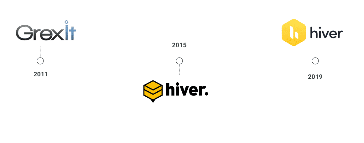
Also, this isn’t our first rebrand. Back in 2011, we were known as GrexIt. In 2015, we rebranded to Hiver (read this post to know why we transformed from GrexIt to Hiver and the lessons we learned along the way). And now we’re at it once again. Change is always inevitable. Yet, it shouldn’t be just for the sake of it. Here’s the inside story of our rebrand.
A new logo
Over the past eight years, Hiver has grown from strength to strength as a shared inbox solution for Gmail and GSuite. As of today, more than 1500 companies of all sizes from over 30 countries use Hiver every day to manage their team emails – and in the process become more collaborative and productive.
Our new logo seeks to convey this evolution.
A short visual history
The origins of Hiver have been derived from a beehive. Since time immemorial, bees have been associated with values such as hard work, focus, efficiency, productivity, teamwork, and collaboration. And the beehive has been their central hub.
The stylized honeycomb in the first iteration of our logo was meant to symbolize these values that Hiver aimed to deliver to its users. The reason to change this logo was not that it wasn’t conveying these values effectively, but that a simple, modern, evolution of it could do the job better.
So here we are with our new logo. One that retains the essence of the original, but at the same time is more refined and easily scalable.
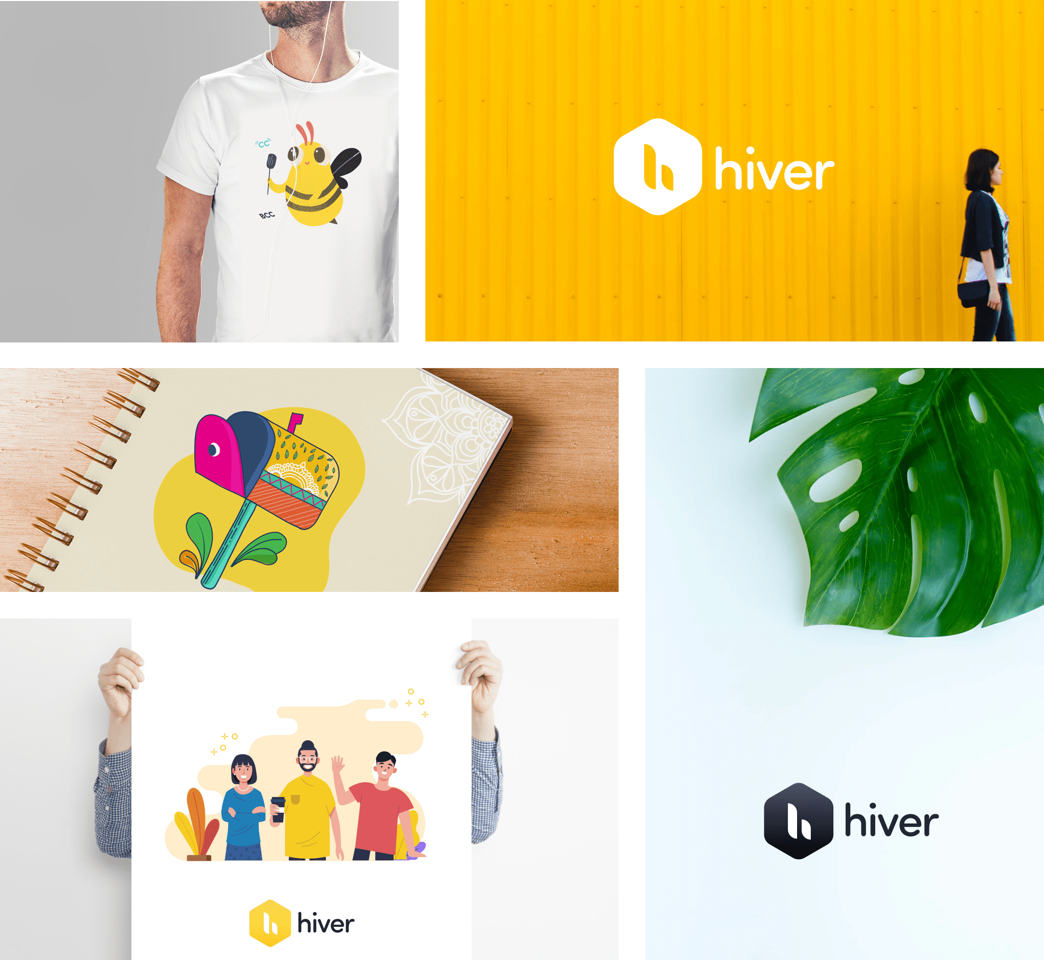
TL;DR We have a new logo. Nothing drastically different, if anything, it is reassuringly similar.
But the logo isn’t the only big change. We’ve refreshed Hiver, giving it a refreshing, new interface that helps improve user experience and efficiency.
A new Hiver
We’ve gone back to the drawing board and redesigned Hiver from the ground up to make it intuitive, scalable, and modern.
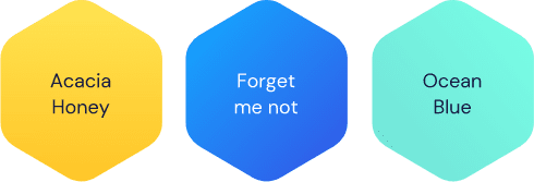
We’ve revisited our color palette, icons, and typography to make it easier for Hiver users to identify their shared inboxes, and help Hiver’s features stand out from the standard Gmail/GSuite features.
We’ve also facelifted the left-hand and right-hand side panels, giving them subtle tweaks to make it easier and faster for users to access their shared inboxes, create tags, write notes and differentiate between the types of activities and alerts on the activity timeline (For an in-depth look at how these features have helped improve our UX, read this post from our design team).
New features
We’ve introduced Views to help users quickly and easily personalize their inboxes and get access to relevant information faster.
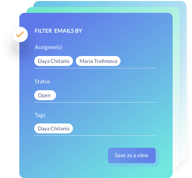
Filters in Gmail are a great set of automation rules that help you manage your emails better. However, they aren’t the most intuitive, especially when it comes to managing shared inboxes and we get that, which is why we’ve introduced views in Hiver. Simply put, views are email groups that Hiver users can create based on a combination of filters. Views have been designed intuitively so that they can be instantly created and accessed from the Hiver side panel with a few clicks, saving you countless hours that would have otherwise been spent on sorting, filtering and searching for emails.
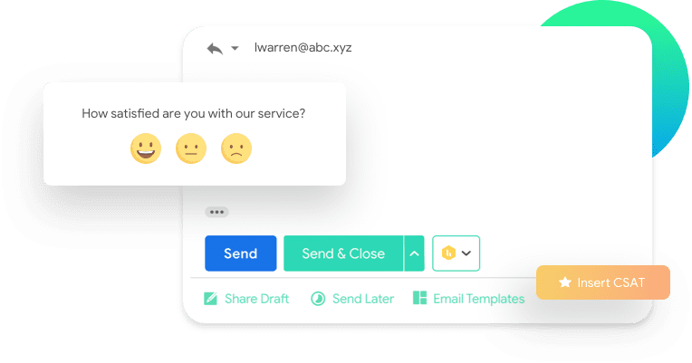
We’ve also introduced Customer Surveys (CSAT) to make it easier for businesses to collect feedback from their customers.
Customer surveys play a critical role in improving the quality of service. For customer surveys to be effective, they need to be served immediately so that customers submit more reliable feedback and yet be non-intrusive.
To make it easy to collect this data in an effective yet non-intrusive manner, Hiver now lets users add minimal, contextual customer surveys with a single click at the end of emails that are being sent out to customers.
Small, yet significant things
The team at Hiver is constantly at work rolling out enhancements to make the lives of our end-users easier. We’ve introduced Roles and Permissions to make it easy for account admins to set up well-defined degrees of control and give hierarchy-based access to their team members. We’ve also introduced Note Search which allows users to quickly and easily search through Hiver notes, making it extremely easy to get access to relevant information.
Wrap up
So there you have it. A vibrant, new logo that showcases our values, product philosophy, and mission. A refreshed new UI and a host of upcoming features designed to help you collaborate better with your team and be more productive. Today is just the beginning. We couldn’t be more excited about this redesign and we look forward to delivering on its promise of helping you make the most out of email.
What’s next?
- If you are an existing Hiver user, I’d encourage you to write in to us and tell us what you like about the redesign.
- And if you aren’t a Hiver user yet, and if you are looking to improve email productivity and team collaboration, we’d love for you to sign up for a free 7-day trial of Hiver.


